

No matter the industry or the type of product your business brings to the market, the key to successful marketing and sales communication always boils down to one thing–your value proposition. You can’t move forward with strategy or campaigns if you don’t pin it down first.
The same applies to your message–it can only be powerful when you have a crystal-clear understanding of who your target audiences are, what pains and urgencies they have, and how you can help them achieve their goals. You can then create a narrative for your marketing and sales teams to better address the challenges of the clients on their purchasing decision journey.
Bear in mind, though, that the medium is the message, so to speak referring to Marshall McLuhan's famous phrase. Even the most cutting-edge products or services will lose in the battle for attention if you don’t present them in an engaging and meaningful form.
This was precisely the challenge The DOW Chemical Company (DOW) was facing when they approached us. As the world’s leading producer of construction chemicals, our client boasted a robust product range. What they lacked was a more enticing format of its presentation–their catalogue featured lengthy product descriptions –and that’s where we stepped in.
Our solution–an interactive visualisation
While data in text form can come across as confusing and bland, presenting it in a visual way spices things up. It also helps extract meaning from that information much more quickly and efficiently.
Data visualization can be static or interactive. For centuries, people have relied on static visualisation like maps, charts, diagrams or infographics (btw, check this, and this example from our portfolio!).
Interactive visualisation, just as the name suggests, lets you drill down into the details of the graphs using your mobile device or computer and then interactively decide which data you see and in what order. It is thus a perfect format to break down complex, information-dense chunks of content into more digestible bits–and that’s why we recommended it to DOW.
We decided to turn their static-by-default catalogue into an engaging mobile app that would captivate the attention of the users and invite them to interact with DOW offering in a non-linear way, just like in games. So instead of listing all products, we decided to present them in context to shed even more light on the value DOW brings to its customers.
How do you create an interactive visualisation?
Information architecture
Living in the times of information overload, modern consumers seek pieces of data that immediately resonate with them rather than plough through in-depth descriptions. It is once they know that a given item may be what they need that they look for more detailed specifications.
Your interactive visualization should not only catch the attention of the target audiences but also help them gradually improve their understanding of your product. This is the approach we followed when designing information architecture of the catalogue.
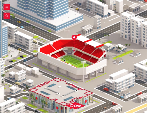
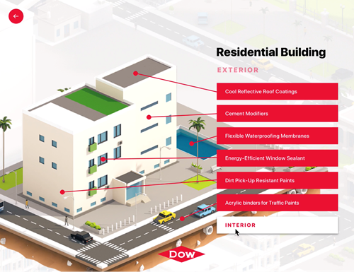
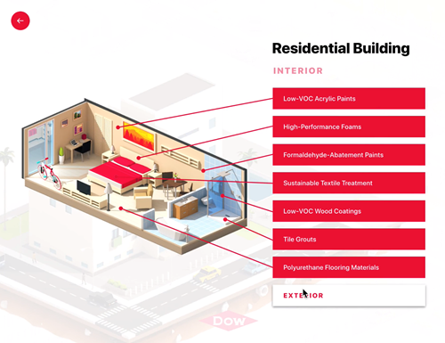
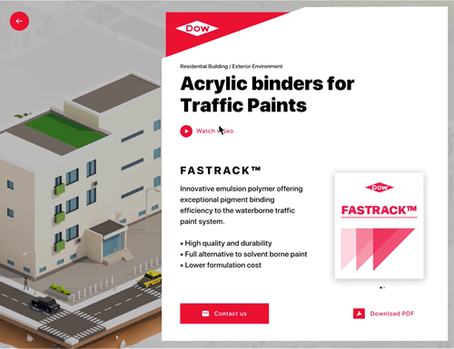
Instead of shoving chunks of complex product data down the app users’ throat, we catered to them with more digestible bits of information. Starting with a high-level overview, they successively gain access to more advanced product details, including extended descriptions, videos, and downloadable brochures.
Product design and development
Building mobile products consumes more time and resources than other media formats. That’s why we decided to apply a lean product development approach–and validate our ideas before any programming would take place.
Once the MVP (minimum viable product) proved our assumptions right, we proceeded with copywriting, graphic design, UX, coding, and testing–and managed to get everything done in around four weeks. The deadline was strict as DOW needed the new catalogue for their forthcoming trade fair–to let individual visitors browse it freely but also equip the sales team with the ultimate presentation tool.
Inspired by the look and feel of the interfaces of mobile maps and games, our app allows for all key user actions, such as scrolling, tapping, or zooming in and out. We focused on Android development, as this was the OS used by the DOW’s touch display system.
The results
The new tool empowers both the marketing and sales teams of DOW Chemical. The catalogue lends itself well to all different formats of touch screens used at trade fairs and events, while sales representatives rely on it during individual discussions with the clients–using tablets and other mobile devices.
Final takeaways
The interactive visualisation may be precisely what your business needs if you have a complex range of intertwined products or services. Using this media format can help you simplify and revamp the delivery of technical details, moving from extensive specification to an ‘at-a-glance’ presentation of your product data.
As a result, you can expect your value proposition to shine through–equipping your sales team with a versatile tool and ultimately empowering them to serve the client better.
Do you want to learn how interactive visualisation can improve communication of your value proposition? Get in touch and let’s get the ball rolling.
